
Premia Pizza facelift
Designer: Maris Mitt
Packaging Design
Adobe Illustrator, Adobe Photoshop
2023
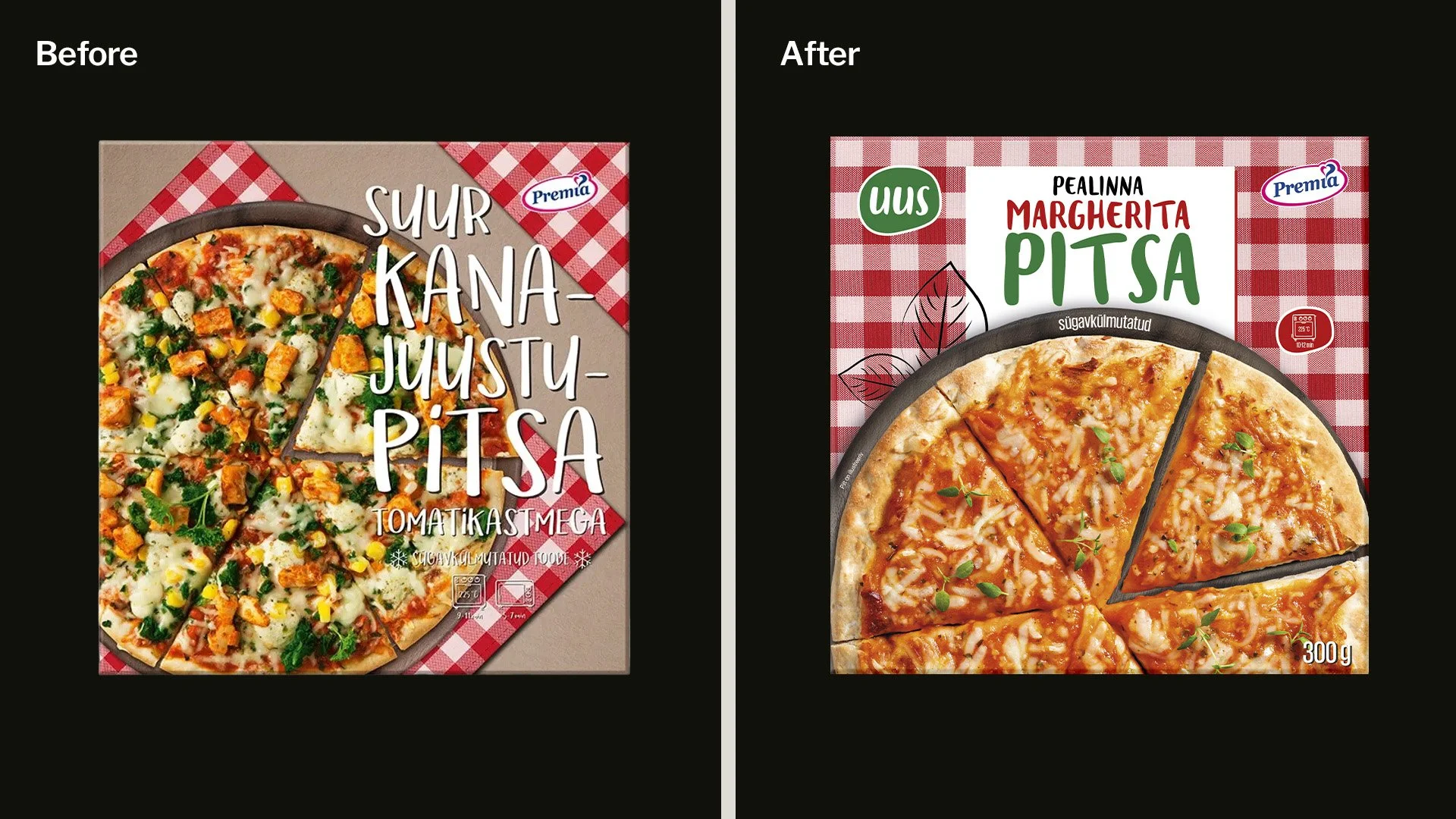
Premia’s existing pizza packaging had a strong and recognisable identity, but the typography was difficult to read against the imagery. The overall design also felt dated and needed a more contemporary look while still maintaining the visual elements customers already associated with the brand.
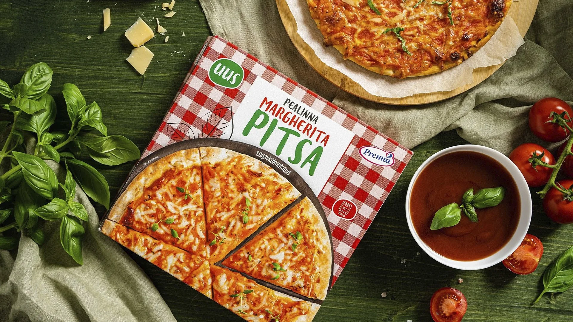
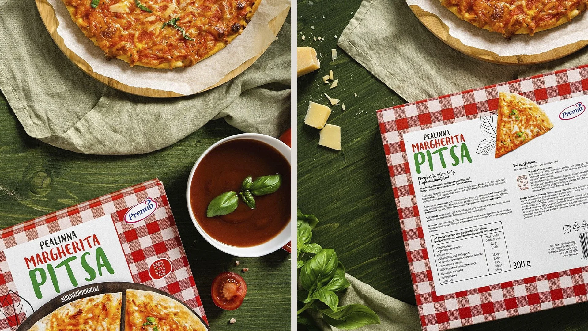
The redesign focused on improving readability and refreshing the overall visual language. I introduced a new typeface with a bold, playful character that complements the organic shape of pizza dough and gives the product name more presence on shelf. To retain the brand’s recognisable character, I kept the familiar checkered tablecloth pattern as a key visual element. At the same time, the layout was simplified to create more breathing room and a clearer hierarchy. As an additional client request, the pizza names were brought under the “Pealinna” name, following a similar naming structure used on Premia’s pelmeni packaging. This helped create a stronger connection between the different products within the brand portfolio.
The refreshed packaging combines Premia’s existing visual identity with a cleaner and more contemporary approach. The new typography and simplified layout make the product name easier to spot and read, while the familiar checkered pattern preserves the recognisable character of the original packaging.